
Folk Fest 2012
Each year, we have the very good fortune of working on the promotional materials for the Ann Arbor Folk Festival. This year we focused our concepts on letterpress. There were so many good reasons to go this route, and of course our dear friends at The Ark gave us the freedom to follow our interests and make it come to life.
In the past few years, there has been a revival of letterpress. I think it’s a reaction to the over-digitized world we live and work in now, at least it is for me. I push pixels around all day long, I design more web sites than printed pieces, and if I am working with a client wanting to print something they often go with the ever-economical digital output. There are reasons for these decisions, but thankfully people are finding enough reasons to create interesting letterpress work as well.
More and more small shops are opening up. Last year we were introduced to the folks here in Ann Arbor at Elevated Press. There is a new studio (“creative enterprise”) in Detroit’s Eastern Market called Signal-Return. Folks are collecting presses, putting them in their basement, and creating lovely pieces for weddings and parties. Others are just bringing back the type.
Last May, I spent a weekend in Nashville and came across Hatch Show Print (post here). It was such a happy discovery, I really hadn’t known much about the old techniques of letterpress poster printing. I loved the effect, and of course the oodles of old wood type all mixed together. So with this inspiration, and our recent connection to local artist/engraver/letterpress guru Jim Horton, I knew we could do something very cool for the Festival.
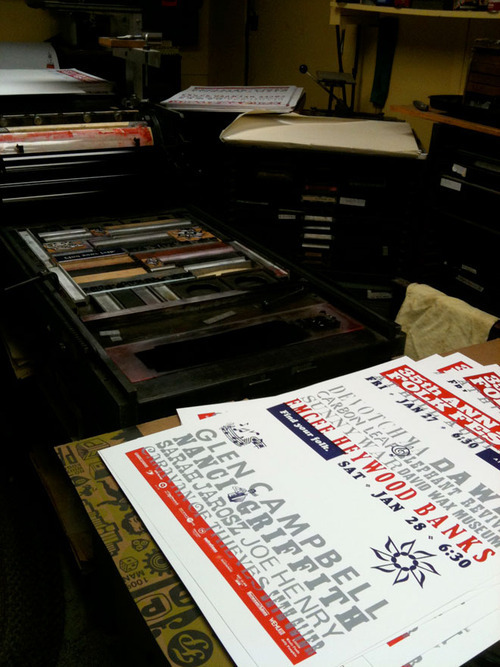
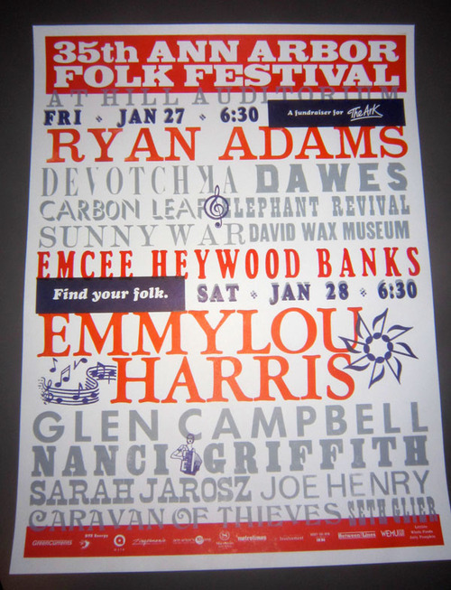
The Festival poster is always a design challenge because of the huge amount of text needed for the artist lineups. With Jim’s hundreds of type libraries in mind, we went with a concept that focused on the words, a feast of type. We were able to utilize his collections, and only order a small fraction of the design elements as custom plates. Turns out there are only a few companies in the country that continue to produce custom letterpress plates and one is here in Owosso, Michigan! Owosso Graphic Arts, they were awesome. Great service, super quick turnaround.
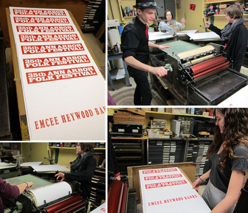
The process was a labor of love. We worked with Jim’s book of type specimens as we laid out the design, suggesting type styles and sizes but knowing that a huge portion of the “puzzle” would be put together in his space when setting up the lockup for the first proofs, pictured above. We had to work through a few changes, getting hierarchy of artists just right, correcting some typos. We looked at the print on a few different stocks, but in the end went with French’s Poptone 100# Sweet Tooth. We wanted a bright white and liked the texture this one offered. Unlike Jim, we preferred irregularities in the printing, less than perfect coverage in certain areas. This toothy paper helped with this effect.
The final printing process took at least four days, one day for each color. Thankfully, helpers were plentiful, from the Q crew to a batch of U-M printmaking students eager to take part. We started with the red.
Followed that with the gray.
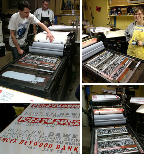
Then on to the purple, only realizing then that the date and time were supposed to be purple. Fortunately, we all liked new gray dropshadow created with the purple on top.
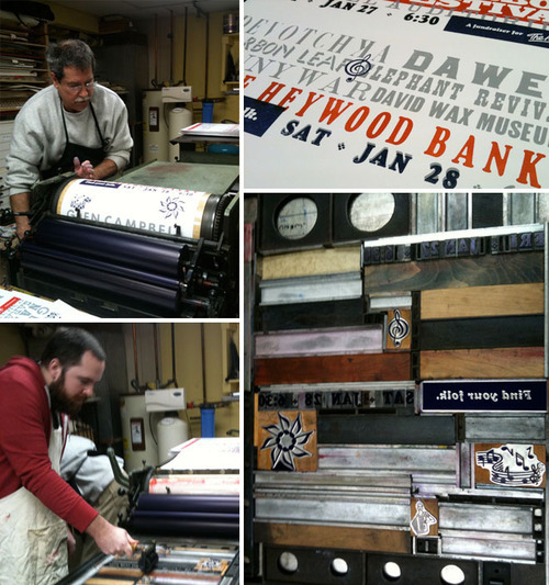
Finally, the orange, our headliners.
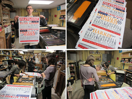
Finished!
We had a wonderful experience working with Jim, getting our hands inky, spending time in a letterpress time capsule. I am already scheming a way to get back there for another project.
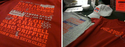
The Festival itself was another big success. Amazing artists, fabulous music. Thank you to The Ark for bringing this to Ann Arbor each year. Thanks to Jim for being such a great guy and interesting person to work with and learn from. Long live letterpress!
Posted by Jocelyn, February 6, 2012